evigmon@tulane.edu
These tutorials assumes that you are a new user to Grace but are somewhat
familiar with a windowing system. They are designed to show you some of the
basic operation of Grace as well as a few of its less intuitive features. Please
feel free to go beyond the bounds of the actions described herein and explore
the possibilities of using Grace. After all, you will be the one who benefits.
The purpose of these tutorials are to give brief examples to show you the basics of how to do something. Essentials and some of the more esoteric features of Grace will be demonstrated to give the user an idea of the capabilities of this program. It is not possible to show everything that Grace is capable of doing. That knowledge only comes with use and experimentation. I recommend that you do the tutorial and then by playing around with things, you will begin to understand them. Finally, when you get stuck, read the user guide to help you.
In referring to what item to select, the tutorial will use something of
the form
Things that are to be typed in will be presented in a typewriter font,
eg, type y = 3*sin(x).
Some of examples require you to input a data file or graph. In such instances, there should be a file in the tutorial directory named data.N or N.agr where N is the tutorial number. For example, when doing tutorial 7.1.3, you should look for a file 7.1.3.agr. It is assumed that each major tutorial section starts with a clean graph.
Some of the following examples require that system commands be run. The commands may be different on your machine or require a slightly different syntax. In this tutorial, an attempt will be made to use the most commonly available UNIX commands. This tutorial was prepared on a Linux machine with kernel 2.0.32.
A couple of points should be made about the GUI before we begin to make life easier.
Even though I do my best to keep this up to date with the latest release, I cannot guarantee it. Think of this a perpetual work in progress. Therefore, if something is wrong, you can notify me and I'll fix it but keep in mind that I am doing it in my spare time for no money.
The object of this tutorial is to do the most basic function of Grace: read in some data into a graph and then label the graph. Along the way, a few of the basic Grace commands and widgets will be introduced.
Start by bringing up the set reading widget Main:Data/Import/ASCII. Select the file 2.1.dat (both double clicking and hitting return work). You should see a black curve drawn on a graph.
Now we would like to add some more sets to the graph, but this time the data file will be in a slightly different format. Looking at the file "2.1.dat" (with the program of your choice), you can see that its several columns of numbers. One way to interpret this file is the first column gives the x-values and the rest of the columns are y-values. From Grace, again open the "Read Sets" widget. This time, check the "NXY" button. Now select the file "2.1.dat". At this point you will have several differently coloured curves.
You should now have 2 copies of the first set since you've read the file twice. It would be nice to eliminate one copy. This is most easily accomplished by bringing up a popup which lists all the sets. Selecting Main:Edit/Data_sets...bring up the Data set props popup. It lists all the sets and for the selected set, its type and a few statistics. To eliminate a set, select it and then press the right mouse button. A menu should appear from which you can select kill. You'll note that there is a kill and kill data. The former totally eliminates everything associated with a set while the latter eliminates the data but keeps the settings for it so that if new data is read into the set, it will have the same properties like colouring and line width, etc. Kill set 0 for now.
We would now like style the sets. Practically all aspects of the curves are configurable including colour, line thickness, symbols, drop lines, fills, etc. These operations are available under the "Set appearance" widget which is invoked by selecting Main:Plot/Set appearance... or by double clicking near the target set within the graph frame.
When the widget comes up, there will be a list of the sets with their number (eg. G0.S1 refers to set 1 in graph 0). Later operations will require you to know the number. Like the data sets pop up, clicking on mouse button 3 in the set list will bring up the menu of set operations.
The simplest way to colour all sets differently is from Set_Appearance:Data/All colors. First select the sets which you wish to recolour and then select Set_Appearance:Data/All colors. Do this now to your graph.
When a set in the list is highlighted, the widgets change to reflect the settings. Practically all aspects are configurable. Experiment by changing the line colours and widths, placing a symbol at each data point, not connecting data points and fill the space between the x-axis and the curve. Don't forget to try out what is available under the other tabs besides Main. To see the effect of a change, you have to hit the "Apply" button. N.B.: Things are drawn in numerical order so if there is overlap, the highest numbered item will be on top. This applies to graphs and sets within each graph.
Aspects of the axes are controlled by the axes popup which is called from Main:Plot/Axis properties or by double clicking the graph frame. All aspects of the axes can be changed like the title, the font, colour, whether or not to draw grid lines, or user defined tick marks and labels. There are many settings and the best thing to do is to experiment to see what each setting does.
For now, let's start by labelling the axes. Suppose these curves represent
the number of tasks a processor runs as the function of the number of users.
To make it more interesting, assume we are doing this in Quebec. That means
we want to plot "Nombre de t�ches vs. nombre d'usagers". Note the importance
of having the accent over the a in t�ches or we would end up plotting the number
of stains which is entirely another case. Bring up the Axes pop up, select
the Y axis, and click in the space to enter the label string of the axis label.
Start typing Nombre de t. At this point we need to enter a accented letter,
so we bring up the font tool by pressing Control-E. You will now see what we
have typed in the Cstring widget. Move the cursor to where you want to place
the accented letter and click on the letter. It should now appear in the string.
You can either finish the string here or hit accept and keep editing. Label
the x axis as well. This font tool is available wherever text needs to be entered.
All the attributes regarding the axis labels like size, colour, font, position are changeable.
Our next exercise will be to title the graph so other. Operation pertaining to this are found in the "Graph appearance" widget which we open by selecting Main:Plot/Graph appearance or by double clicking just above the graph frame.
We can now fill in the title of the graph and by clicking on the "Titles" tab, the font and size and colour can be chosen. The Viewport box under the "Main" tab defines the 4 corners of the graph frame. You can type them in or use the mouse to move them by first double clicking on them.
Other things which can be controlled in this widget are the frame drawn around the graph, whether or not the graph background is coloured and the legends. Legends will be dealt with a little later.
Since we have several lines in our graph, it makes sense that we label them with a legend so that other people can figure out what they mean. The first thing to do is to give each set a label. This is done by entering a legend string for each set in the Set appearance popup. Now, from the Main form in the Graph appearance popup, click on "Display legend" to see the legend box. The location and appearance of the box is controlled by clicking on the "Leg. box" tab. The appearance and spacing of the legend entries is controlled by the "Legends" tab. For simplicity, label the sets alphabetically and then play with the appearance, etc. to get something you like.
Specifying the placement of the graph by entering the coordinates can be painful, especially the fine tuning. To alleviate this problem, a graphical method is also available, although not readily apparent. After a legend appears, it may be dragged to a new location. To do this, press Ctrl-L with your mouse on the main canvas. You should see the arrow cursor turn into a hand. If this doesn't work, double click on the main canvas (to get its attention) and then press Ctrl-L. Click on the legend and drag it. To cancel the legend drag mode (as with all other modes), click on mouse button 3.
I got bored so I took the data files and produced my own, albeit ugly, graph. See if you can copy mygraph.png
A block of data is a table of number which are interpreted as columns of numbers. How sets are created from the columns depends on the information you want to extract from the file.
We first need to read in a block of data. We do this from Main:Data/Import/ASCII. Select the file "3.dat" and Load as "Block data". If the read was successful, a window should pop up asking you to create a set from the block data. At the top it will list how many columns of data were read.
First we choose the type of set we would like. For now we'll stick with xy.
Next we choose which column of data contains the x-ordinate. If there is no column, we can select "index" which will use the index into the column as the x ordinate starting from one.
The values Y1 through Y4 are used for selecting error bars as may be needed by other set types.
The last thing to specify is the graph into which to load the set if we have more than 1 set.
Finally, hitting accept will create the set.
If you close this window, it can reopened by bringing up a set list (eg. Main:Edit/Data_sets) and then selecting Create_new/From_block_data from the menu brought up by right clicking on the set list.
Try creating a new set of type XYdY. This is an XY curve with error bars. Try X, Y, and Y1(the error) from different columns.
Besides reading in data files, Grace has an extensive scripting language with a large number of math functions built in, These function include the basic add, multiply, square root, etc, and also the cephes library of higher order math functions like Bessel functions and the gamma function. Hence, functions in Grace are basically unlimited. See the user guide for more details. In addition, users can dynamically add libraries to Grace with any desired function. As well, points may be added manually to a set by the use of editors. To begin, choose Main:Edit/Data sets. To create a set, press mouse button 3 (the rightmost one for right handed people) anywhere within the data set list (which may be empty) and select Create new. A menu with 4 different ways of creating new sets will be presented. We'll go through them one by one.
The load and evaluate window will pop up when this is selected.
Below are a few samples:
0, Stop load
at: 2*pi, Length: 100, X=$t, Y=sin($t)0, Stop at: 2*pi, Length: 100,
X=cos($t), Y=sin($t)If your system has the Xbae widget set, this choice brings up a spreadsheet like editor to allow one to enter the points of the set by hand. Initially, it just has the point ( 0, 0 ). Clicking on add will insert a copy of the currently selected row immediately below the selected row. Clicking delete will delete the row which contains the cursor. This method is best suited to examining or modifying existing sets or creating very small sets. The sets gets updated after one hits enter or leaves the cell.
If your system doesn't have the Xbae widget set or you want the power of your favourite external editor, a text editor of your choice may be used to enter data. The editor is selected by the GRACE_EDITOR environment variable. If the set is new, it will contain only the point (0,0). During editing, no other operations are possible. After the editor is closed, the set will be updated.
This creates a new set from a block of data which has been read in. See section 3.
Grace supports a large number of command line options which allow the user to control the appearance and placement of graphs. This can be very useful if you want to use it to quickly print something without going through the GUI, use it within a script to automatically generate graphs, or have a plot come up already configured which can be much quicker than going through the GUI menus.
Invoking Grace with the command "grbatch"from the command line will cause Grace to start, produce a plot, send it to the printer (unless a file is specified) and then exit. In its simplest form, to produce a plot of the file a.agr, type
gracebat a.agr
If gracebat is unavailable on your system, the hardcopy option to xmgrace will do the same thing. Assuming the hardcopy device is a postscript printer, one could also type
xmgrace -hdevice PostScript -hardcopy a.agr
Often, one wishes to plot several graphs with each graph having different characteristics. This is easily accomplished from the command line. Options specified on the command line are parsed in order and stay in effect until overridden by specifying them again.
Let's try an example. We will assume 5 plots, the first 4 of which are to be stacked vertically, and the fifth inset into the fourth. We wish to plot the files a.dat, b.dat, c.dat and d.dat with the inset graph being a magnified portion of d.dat. Assume a.dat contains multiple columns of data, b.dat is a block of data from which we wish to make a curve from columns 2 and 4 with the error given by column 3, c.dat is to be represented as a bar graph, and for the inset graph, we wish to graph to region (0,0) to (1,1). This can be accomplished by
gracebat -pexec "arrange (4,1,.1,.1,.1,ON,ON,ON)" -nxy a.dat -graph 1 -block b.dat -settype xydy -bxy 2:4:3 -graph 2 -settype bar c.dat -graph 3 -settype xy d.dat -graph 4 d.dat -world 0 0 1 1 -viewport .15 .3 .8 .88
Note that the graph numbers start at 0 and that 0 is the default so it does not have to be specified for the first graph.
Undoubtedly, you will reach a point where you want to do something for which no command line option exists. (We have been doing this with the arrange command.) This is where Grace's parameter file language is vital. The option "-pexec" will execute the next argument as if it had read it from a parameter file or excuted on the command line. If you want to do something more complicated than one command, you can use several pexec's or put the commands in a file and run the file with the "-batch" option.
To read in the files foo.dat and bar.dat and scale foo.dat in Y by 1000, the simplest way is
xmgrace foo.dat bar.dat -pexec "s0.y = s0.y * 1000"
To do the same as the previous example but also label the axes and recolour the curves, make a file called "bfile" with the Grace commands
#Obligatory descriptive comment
s0.y = s0.y * 1000
s0 line color 3
s1 line color 4
title "A Gnasty Graph"
xaxis label "Time ( s )"
yaxis label "Gnats ( 1000's  )"
autoscale
and then run xmgrace with
xmgrace foo.dat bar.dat -batch bfile
This tutorial will explain some of Grace's curve fitting abilities. Grace can perform two types of fittings. The first type is regression or linear fitting where optimization is done on a linear equation or an equation which can be expressed in a linear form. This includes fitting polynomials and certain forms of equations. The other type of fitting is nonlinear and allows for arbitrary user supplied functions.
Let's take a curve and see how each type of fitting works. To begin, create
a curve of the function y = sqrt(x) + exp(x)/3 -1 over the range 0 to 3 with
100 points.
Choosing Main:Data/Transformations/Regression will pop up the Regression window.
We pop up the widget by selecting Main:Data/Transformations/Non-linear curve fitting. You may want to kill all the sets except the original function and the extrapolated function at this point.
y = a0*sqrt(x) + a1*exp(x)
+ a2.You can rotate sets around an arbitrary axis perpendicular to the canvas (e.g. the Z-axis). Also it is possible to scale sets and translate them.
It is possible to perform operations between sets. With many operations, however, it is required that the 2 sets have the identical abscissa, i.e., the x values of both sets are the exact same. This is necessary since most operations are performed on a point by point basis. Eg. multiplying 2 sets is done by multiplying the Y values of the 2 sets together to produce a new Y value. About the only operations that don't do this are filtering and convolution. Fortunately, Grace has a function to help out when the abscissas differ. It is called interpolation which interpolates a set over the domain of another set to produce a new curve.
Let us now add the cosine of a set to the sine of another set to create a new curve. However, we will complicate this example by having different domains with different sampling:
s4 length
s2.lengths4.x = s2.xs4.y = cos(s3.y) + sin(s2.y). S4 on. For the GUI
minded (no offense intended), bring up a set list with the set operations menu
(eg. Main:Edit/Data_sets or Main:Plot/Set_appearance),
select set 4 and unhide it by selecting show from the operation menu (mouse button 3). N.B. If the abscissas of the original curves had been the same, we could have started at step 5. If the sampling had been the same we could have skipped step 4.
Feature extraction is a way of creating one curve from a family of curves. It generates one data point from each curve by measuring a characteristic of the curve. For example, one might have a series of curves which plot the gnat population as a function of time. Each curve is produced by varying some condition, like the number of gnus in the environment. Using feature extraction, one could use this family of curves to produce a new curve of the peak number of gnats as a function of gnus or the time of the peak number of gnats as a function of the number of gnus. This is most often useful with more than one graph.
Often we only wish to examine part of a data set or perform transformations only on a portion of one. Restrictions allow us to define a region of the graph on which to perform operations.
There are several ways a region may be defined. It may be defined by a straight line (left of, right of, above, below), by a polygon (inside or outside), or by a range ( in x, out of x, in y, out of y). Call the define region popup from Main:Edit/Regions/Define. Choose which one of the regions you would like to define, and press the define button.
Define the ends of the line by clicking with mouse button 1.
From the define region popup, choose a polygon type and then the define button. Use mouse button 1 to pick the vertices of the polygon and then mouse button 3 when you are done.
From the define region popup, choose a range type and then pick 2 points which define the range.
Regions may be only be used to restrict an expression evaluation. Bring up the evaluateExpressions popup (Main:Data/Transformations/Evaluate_expression). Choose the source and destination sets and specify the formula to apply to the region of interest. Not specifying an expression is equivalent to the identity transformation. Choose the region you wish to use. By checking negate, the complement of the specified region is used.
Click on Apply to perform the operation. The resultant set will be the expression evaluated only on points contained in the specified region. Thus, if no expression was specified, the effect is to produce a new set of only those points contained in the region. Conversely, to delete points in a region, leave the expression empty, and negate the region selection.
Pipes are a way of capturing the output of a running process without the intermediary step of pacing the output in a file. Instead, the executing program puts the data in one end of the pipe, and Grace reads it from the other end of the pipe.
On certain popups, e.g. Main:Data/Import/ASCII, the option to read from a file or pipe can be specified. If a pipe is chosen, the command in the selection widget will be run and the stdout will be captured and treated as though it was data which was read from a file.
A named pipe is a special case of the pipe previously described. In the previous case, after the program has finished execution and the output had been read, the pipe was destroyed. A named pipe is a static structure with the property that multiple processes can write to and/or read from it. The purpose of using a named pipe with Grace is to start up a Grace window and then control Grace by sending commands and data through a named pipe. This is very powerful and lets you do practically anything you can do directly from the GUI. To use this feature, try the following:
mkfifo pvc. If
you do a directory listing, you should see the file pvc.xmgrace -npipepvc&. Grace is now monitoring the pipe for any data which might be sent
to it. It will interpret things as though they were entered using the command
interpreter. echo "read \"8.2.dat\"" > pvc. (The back slashes
are needed to escape the quotation marks so that Grace really received the
command :read "8.2.dat".) This just told Grace to read the file data. Now we
would like to autoscale. We could simply click on the button but the point
is to use a named pipe. This time we type echo autoscale > pvc followed
by echo redraw > pvc. Your graph should now have autoscaled and redrawn.
Exit Grace with echo exit > pvc. You should also clean up by removing pvc.When multiple graphs are present, a graph is selected by clicking inside the graph frame. In cases where graph frames overlap, clicking will cycle among the overlapping graphs.
It might be annoying if one is trying to work in a region of overlapping graphs. If will not be possible to double click on something because the each click will be interpreted as a single click and you will only end up changing the graph focus. In such an instance, turning off the graph selection by clicking might be desirable. Choose Main:Edit/Preferences and then set Misc:Graph_focus to "As set". This means one must explicitly set the focus. Simply bring up a graph list (eg. Main:Edit/Overlay_graphs is but one), select the graph you want to work on and then, using the menu under mouse button 3, choose "Focus to".
Placing a large number of regularly spaced graphs is easily done with Main:Edit/Arrange_graphs. This will automatically calculate the layout:
Note that only graphs which are selected are taken into consideration. So, if you wish to reorganize your existing graphs, make sure they are selected or new ones may be created.
Arranging individual graphs may either be done (1) exactly, by specifying the viewport coordinates from Main:Plot/Graph_appearance or using the previously explained Arrange graphs popup, or (2) roughly, by double clicking a graph focus marker and then moving it.
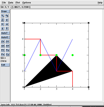
Overlaying one graph onto another is useful for creating a graph with two different x axes and/or y axes. For example, you may wish to have a graph which on the x axis has the month of the year. There could be 2 curves on it, one using the left y axis which is number of gnus sold and one using the right y-axis which is the number of gnats exported on a logarithmic scale. Likewise, if one is plotting spectral data, one could have one x axis in Hz and another one in wavelength. Let's proceed with an example:data
Hot links are a way of of updating a set without having to delete it first and then reread it. The Hot Links window is opened available under Main:Data/Hot links.
The simplest hot link is to a file containing just one set. To make a hot link to a single set, we must first select the set we want to get updated and then specify the file. We may also link to a pipe in which case we must specify it is a pipe to which we are linking. A command may also be entered which will be run every time the hot link is updated. A common command might be autoscale which will make sure that the entire set can be seen if it changes size. It's possible you may want to execute more commands than one. One could, for example, have a set that is a function of 2 sets that needs to be recomputed if either set is updated. If this is the case, put your commands in a file and then use the "READ BATCH" command.
Pressing the Link button will now create the link and if the update button is pressed, the set will be updated with the current contents of the file you linked and the contents of the Command widget will be executed.
For a simple example, read in the set 10.1.dat and set up the hot link. Now, run the command shiftdata.sh and update the hotlink. You should have seen the peak in the graph shift. Try repeating this a couple of more times.
Sometimes a data file may contain multiple columns of data and we would like to be able to link to all or some of those columns. To specify this, select as many sets as there are xy columns of data in the file. The "x y1 y2" format is assumed. Choose the file the data and link. Now in the link list, the links will show the file name with an appended colon and number. The number tells what column of data the link refers to. Any unwanted columns may be selected and unlinked at this point. When the update button is selected, all sets in the graph will be updated.
Instead of having to keep the Hot links window open all the time, the update action is bound to alt-u. If you find that alt-u has no effect, try double clicking inside the graph you want to update and close the window that pops up. This will "alert" the canvas to process future hot key strokes.